
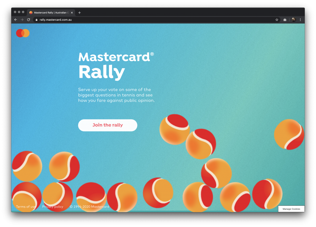
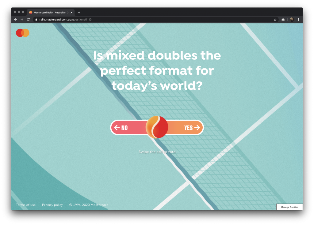
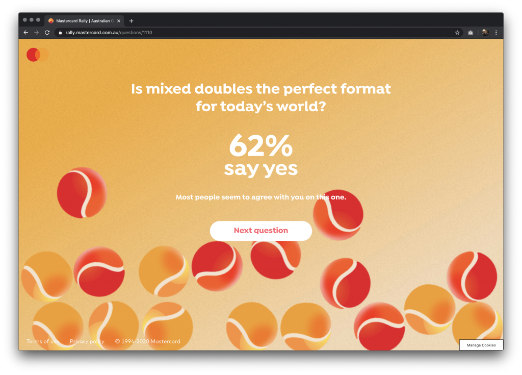
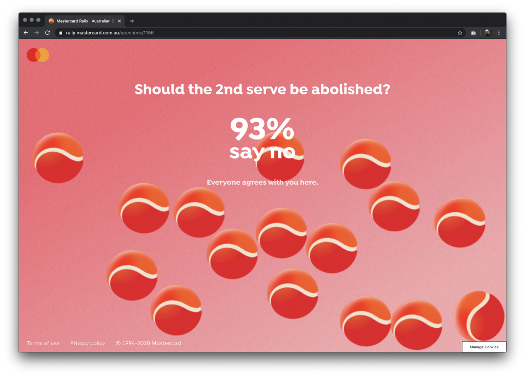
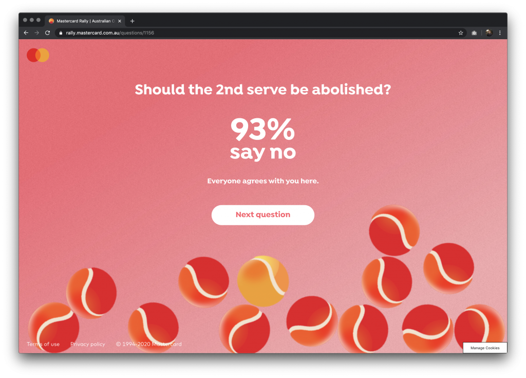
A microsite for Mastercard’s Australian Open campaign. The website enables the users to join the conversation about the hottest questions about tennis.
A microsite for Mastercard’s Australian Open campaign. The website enables the users to join the conversation about the hottest questions about tennis.

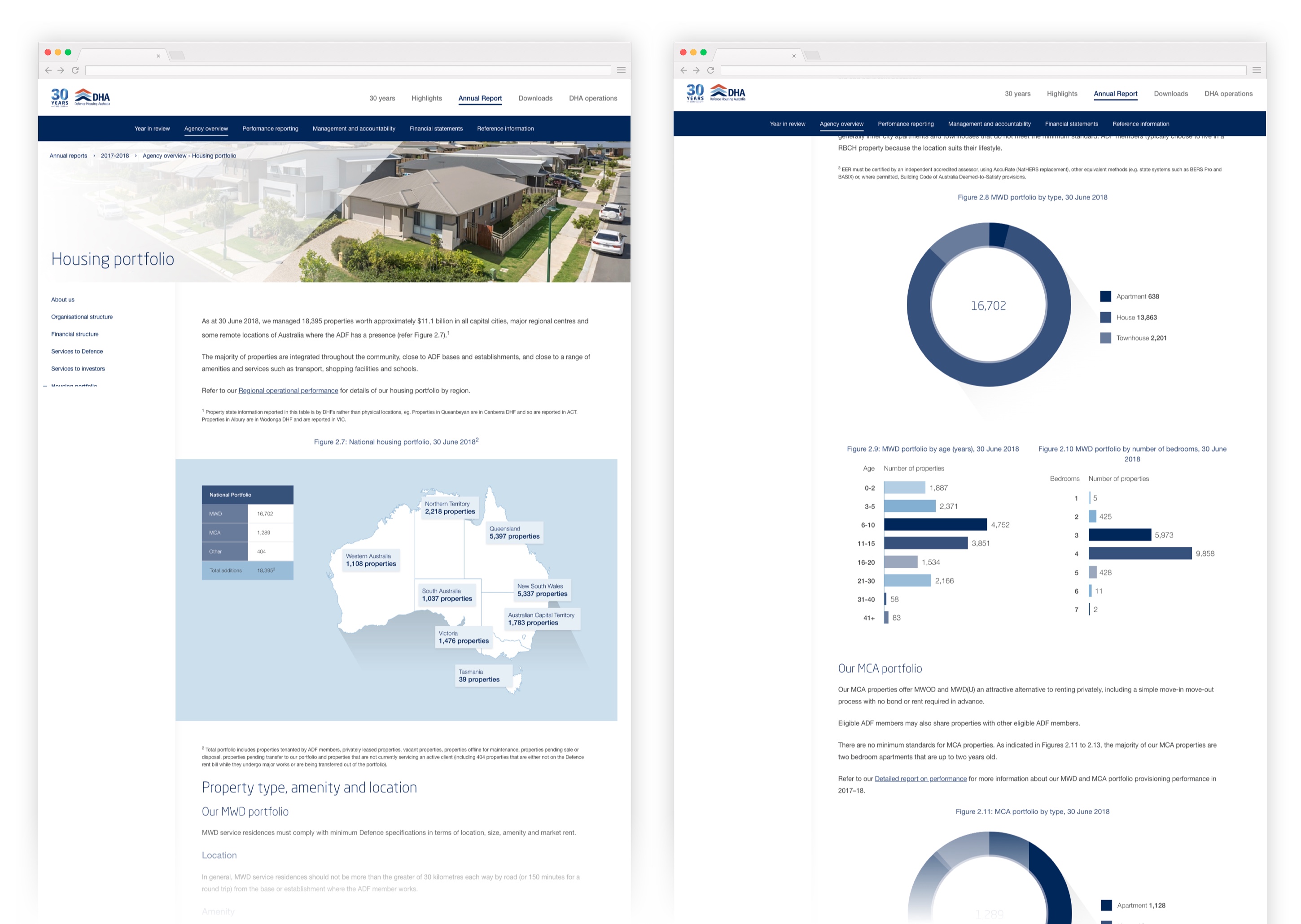
We were tasked to create the online version of Defence Housing Australia’s latest annual report. The key challenge for this project is how to balance design and accessibility.
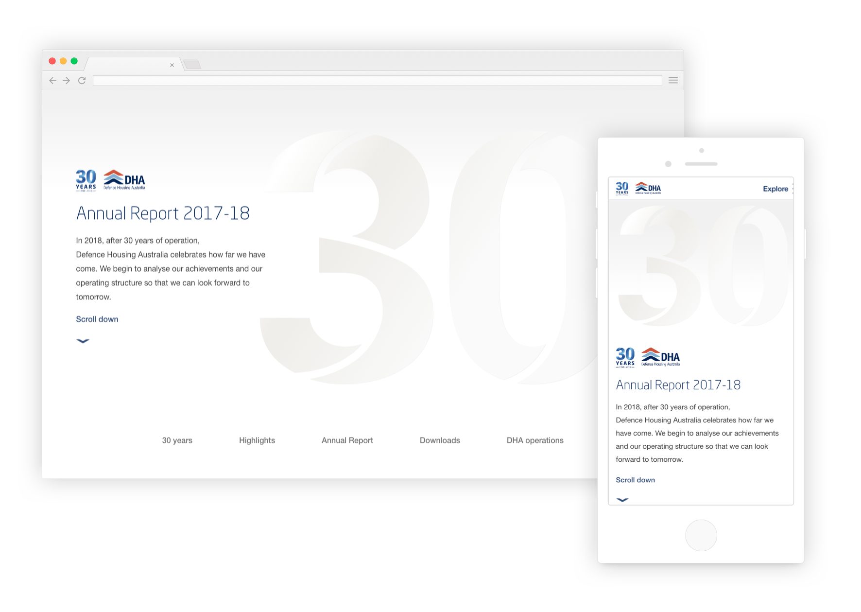
This particular annual report is a lot special than the others because it commemorates the organisation’s 30 years of service. It features an interactive timeline that represents DHA through the years. Users are able to explore the timeline and unravel key facts about the history of the organisation.
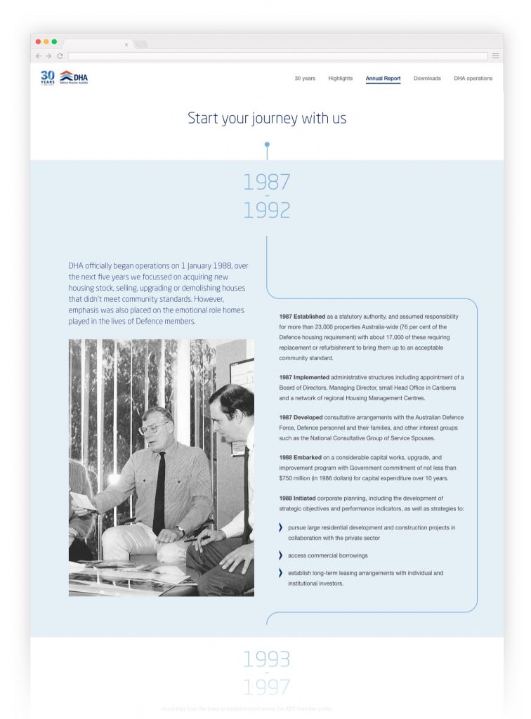
We’ve added subtle animations to make the content more engaging and fun to read. The animations also guide the eyes of the users as they scroll through the page.
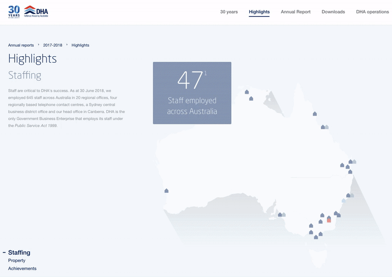
In an effort to be inclusive, all Australian government websites are required to be accessible. A lot of considerations were made to make this years annual report easy to use, navigate and read no matter what device you are using.
Created the entire website’s information architecture, UX and UI design.

[vc_row][vc_column][vc_column_text]
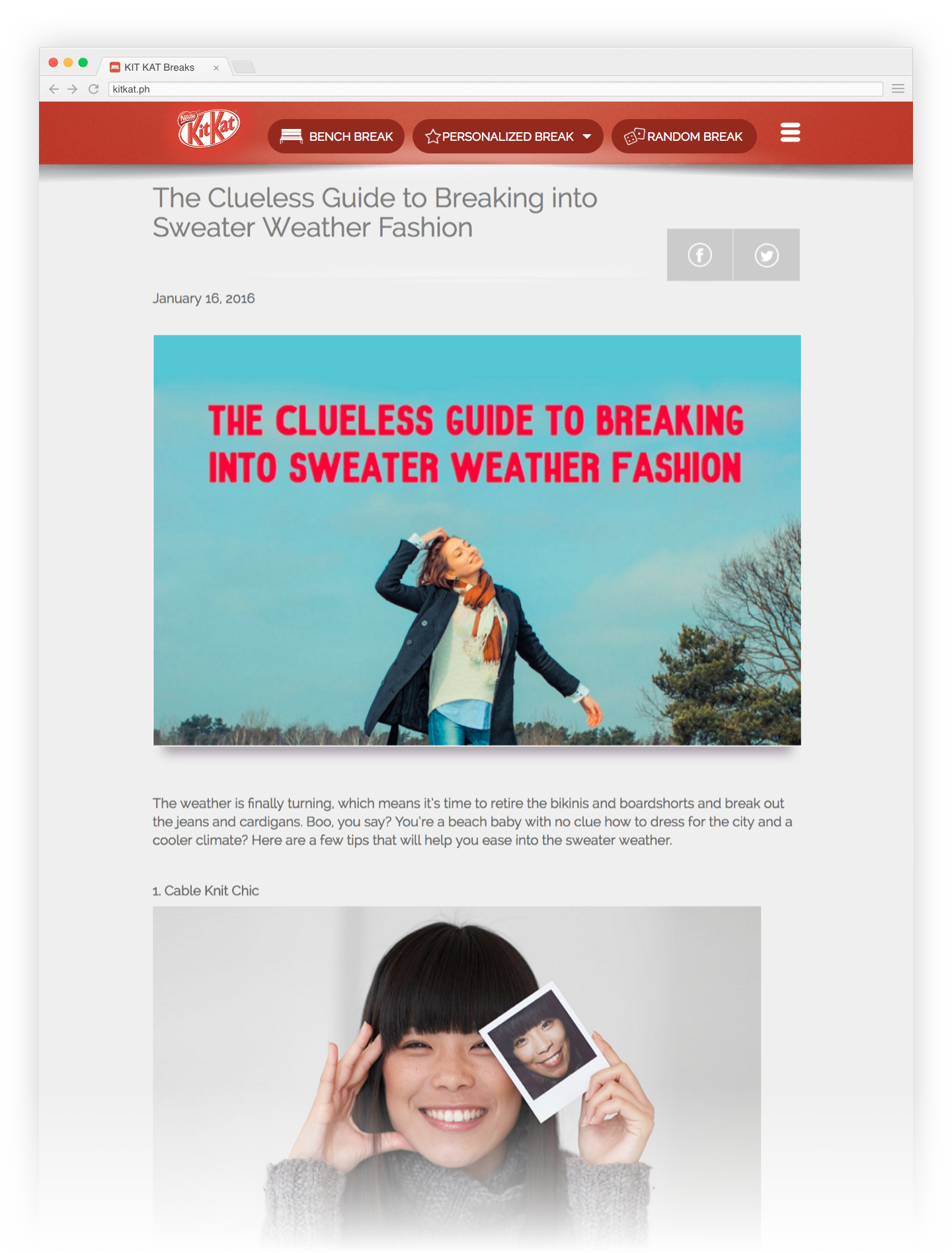
Kit Kat fans feel the need to take a break from time to time. Problem is, they hardly have fresh ideas to do for the breaks. Kit Kat wants to help by creating a site that will inspire their fans to take a break, in a new and fresh way.
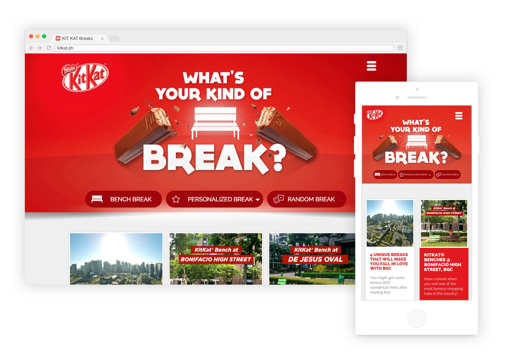
The clean, minimalist and modern user interface design highlights the functionality and content of the website. Navigation is straightforward so users can explore the website faster and easier.
We want to give the users endless things to do during their breaks so they can keep on scrolling to find what they like.
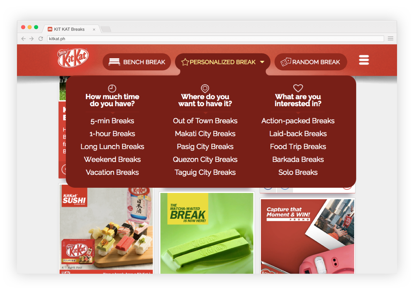
Users can filter the breaks to whatever fits their current situation: they can select 5-minute break if they don’t have that much time; select a city to see if there’s a break nearby; or filter breaks based on their interest. There’s even a random break for those who are undecided!
[/vc_column_text][mk_image src=”” image_size=”large” align=”center” animation=”bottom-to-top”][vc_row_inner][vc_column_inner width=”1/2″][mk_image src=”” image_size=”large” align=”center” animation=”bottom-to-top”][/vc_column_inner][vc_column_inner width=”1/2″][vc_empty_space height=”200px”][vc_column_text animation=”fade-in”]
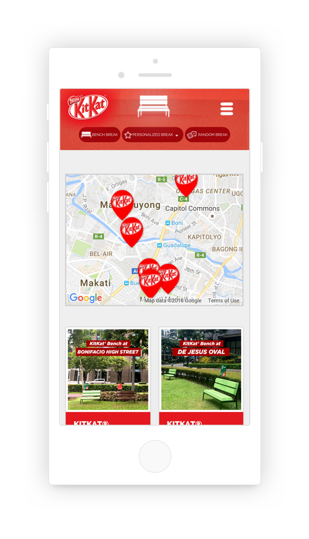
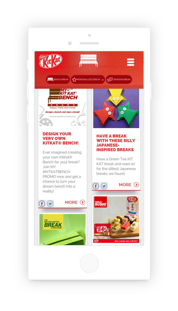
Find all the iconic Kit Kat Benches in different parts of the Philippines.
Users may enjoy the breaks they can find in the website. All articles are shareable on the user’s social media networks.

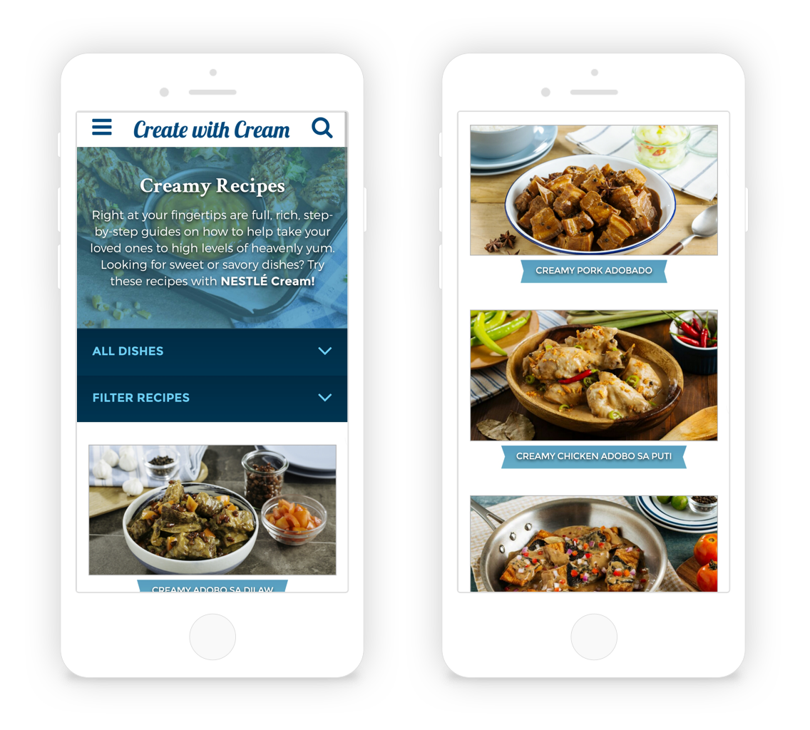
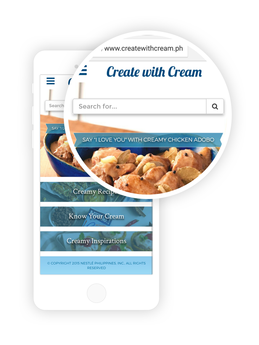
We wanted to create a Nestlé All Purpose Cream’s website more than just a repository of cream-based recipes. The target audience of the brand are moms who are mainly mobile users.
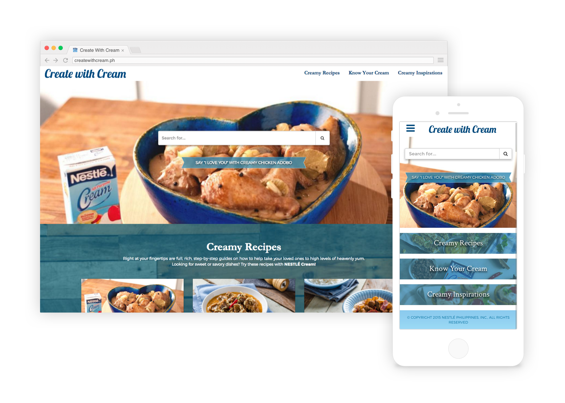
We incorporated a rustic and vintage look but still keeping the brand’s signature element, the cream dollop, and its colors. This new look strays away from the usual food styling and gives more personality to each creamy dish.
Type in a mood, an ingredient, the weather, or anything – it will recommend you a recipe.
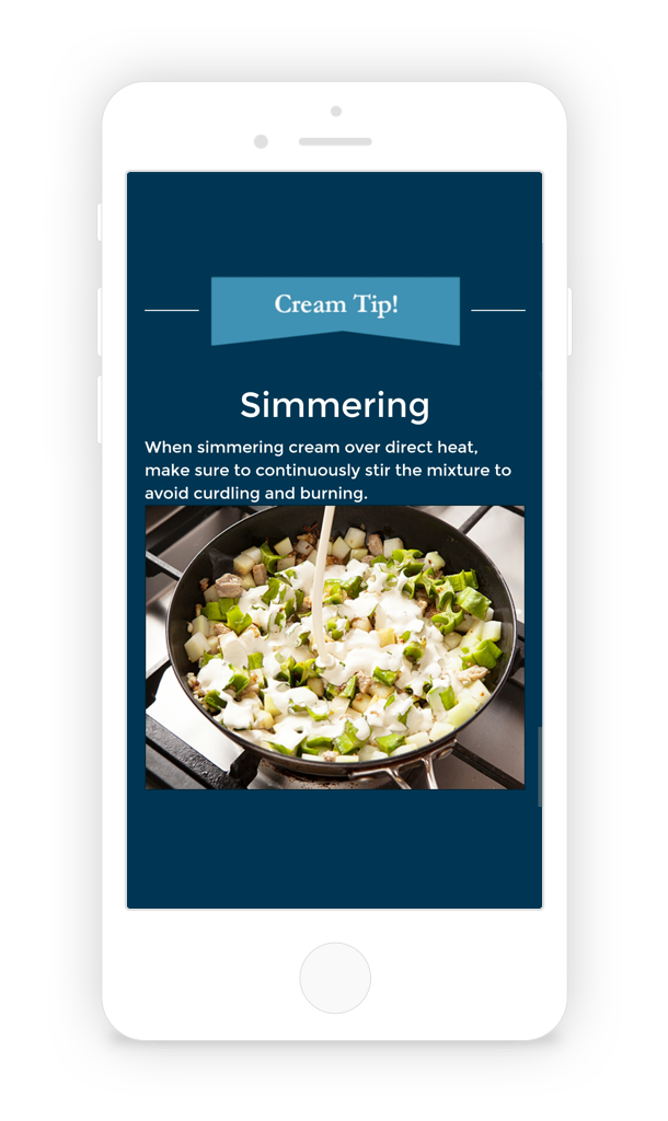
Since the brand is all about cream, a Cream Tip is available to give an idea how to cook, handle and store cream. This is something other brands do not have.
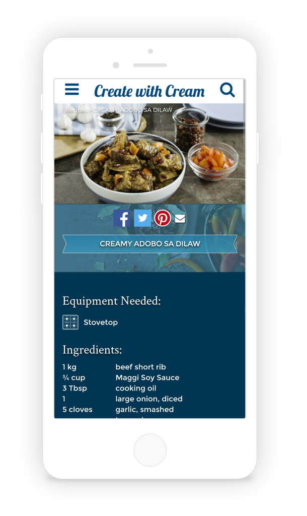
We included important information in all recipes like what cooking equipment will be needed, ingredients and preparation instructions.
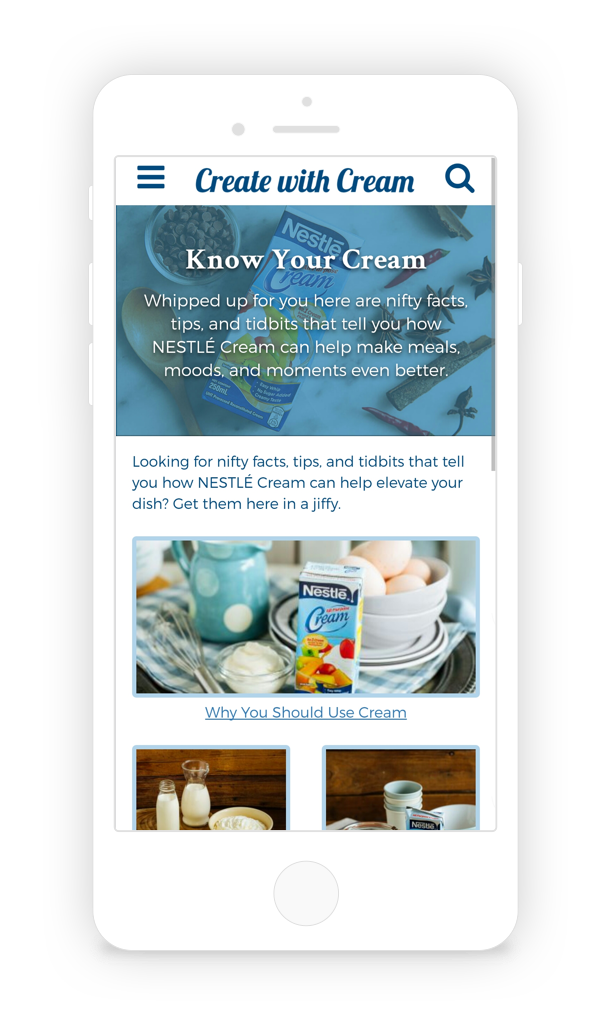
Aside from the Cream Tip per recipe, we’ve dedicated a whole section on all the important things the user need to know about cream such as the different types of cream, storing cream, and a glossary of terms.
This is a new feature launching in the near future.
Our planner painted the picture of the brand’s target market. Together with the creative team, we conceptualised the vision of the website which the client approved. We proceeded with the development of the concept: I created the wireframes and user experience, art director created the design and copywriter wrote all the copy.

The Maggi website started out as a plain and simple recipe website. In 2015, clients felt the website needs to evolve and be more aligned with the brand’s goal: to make every step of Mom’s cooking journey enjoyable.
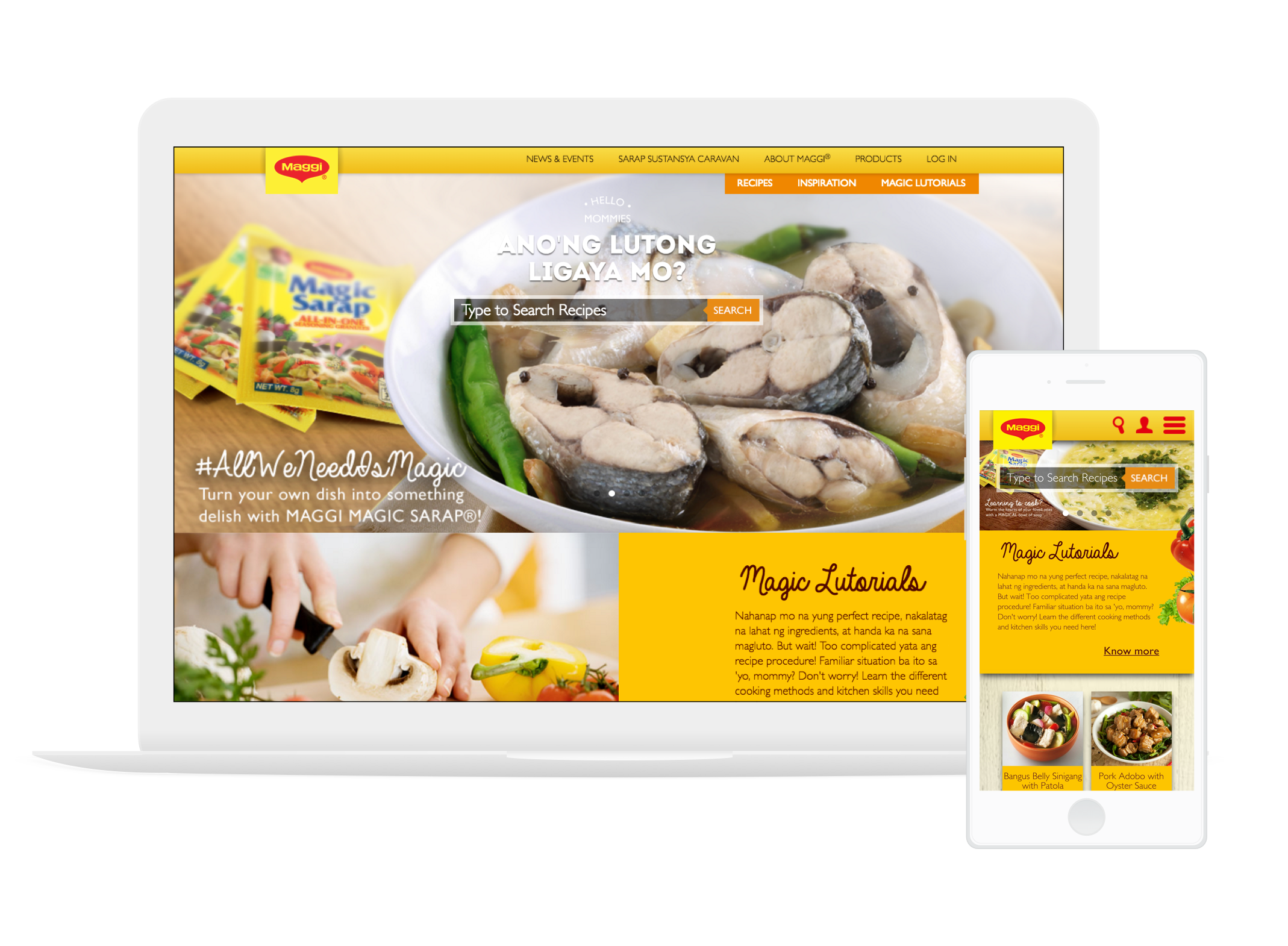
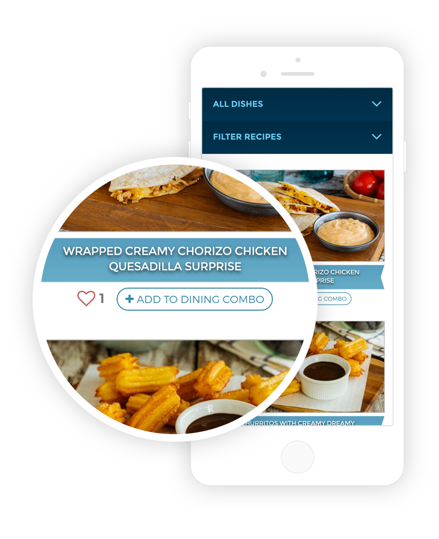
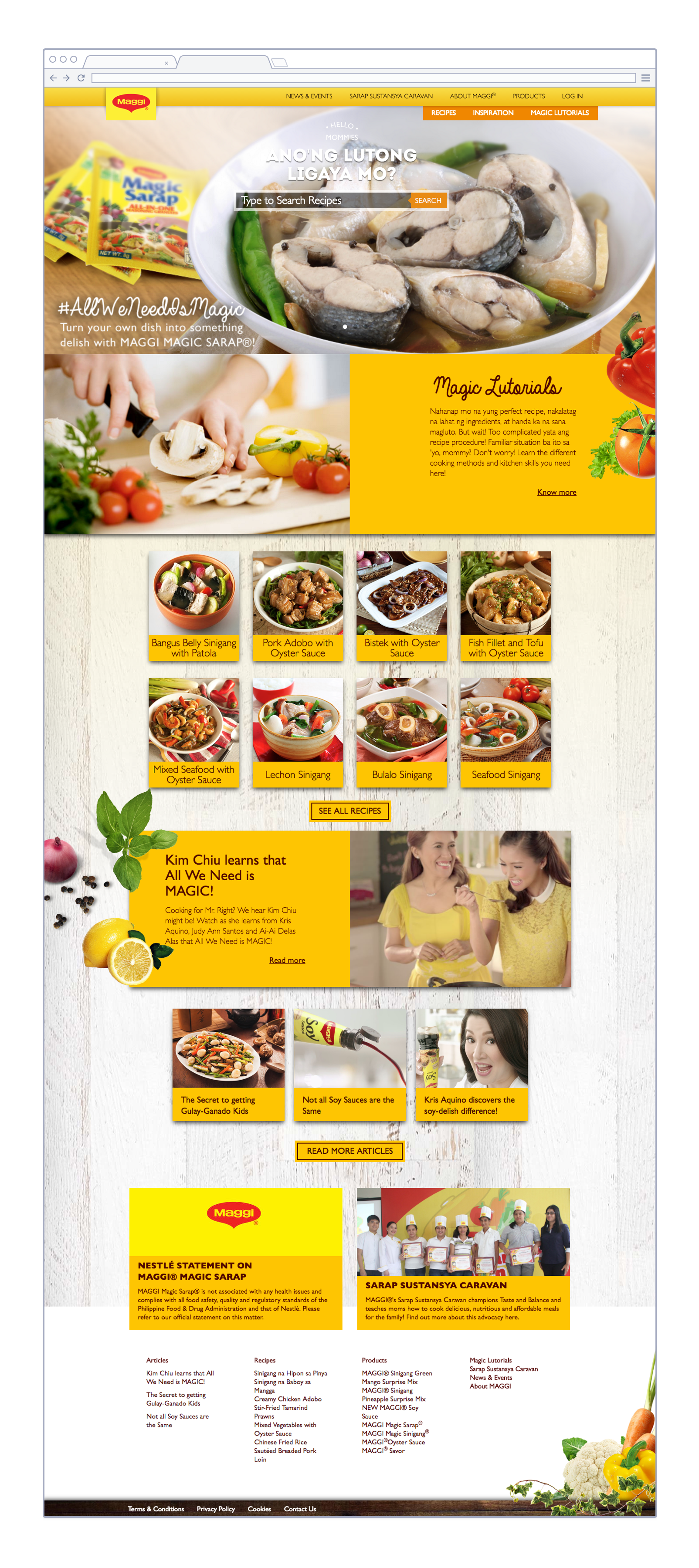
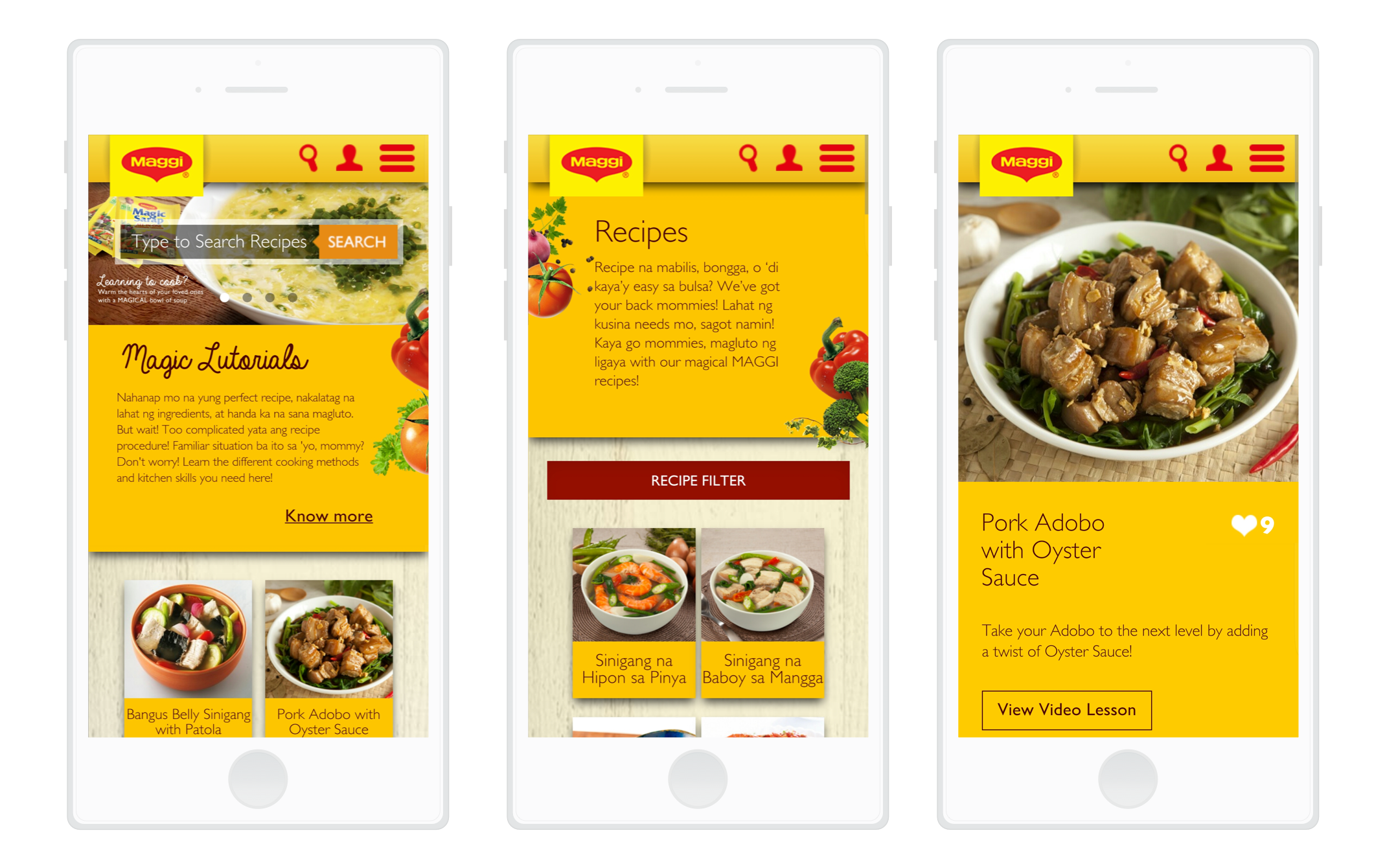
The website has large and taste visuals for more appetite appeal and will encourage the user to explore more.
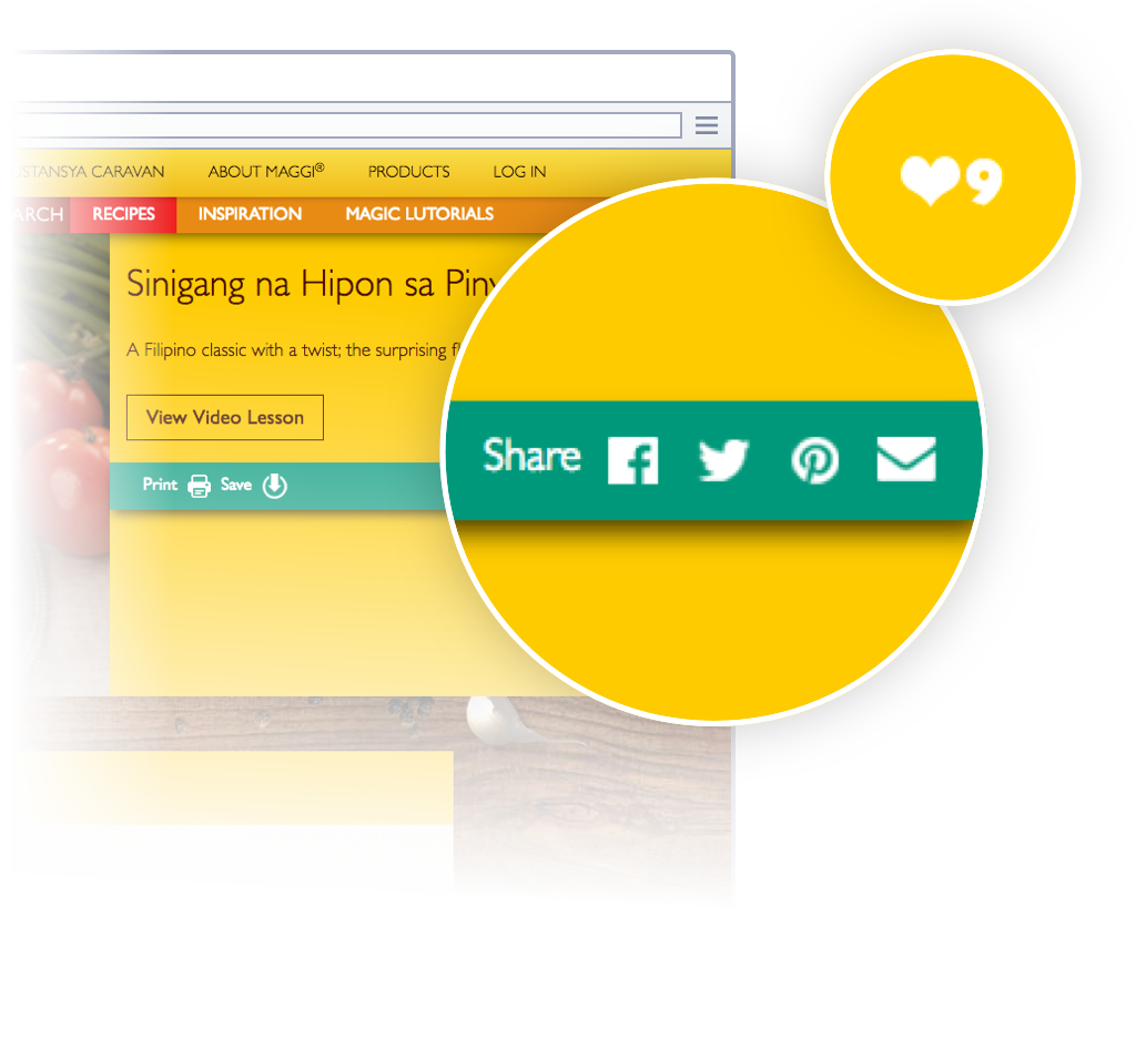
Users may like and share recipes to Facebook, Twitter, Pinterest.
Liking the recipe would place it in the user’s favorite recipes list. 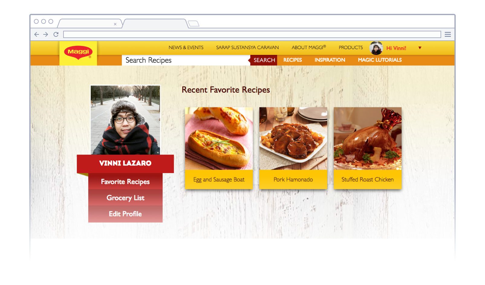
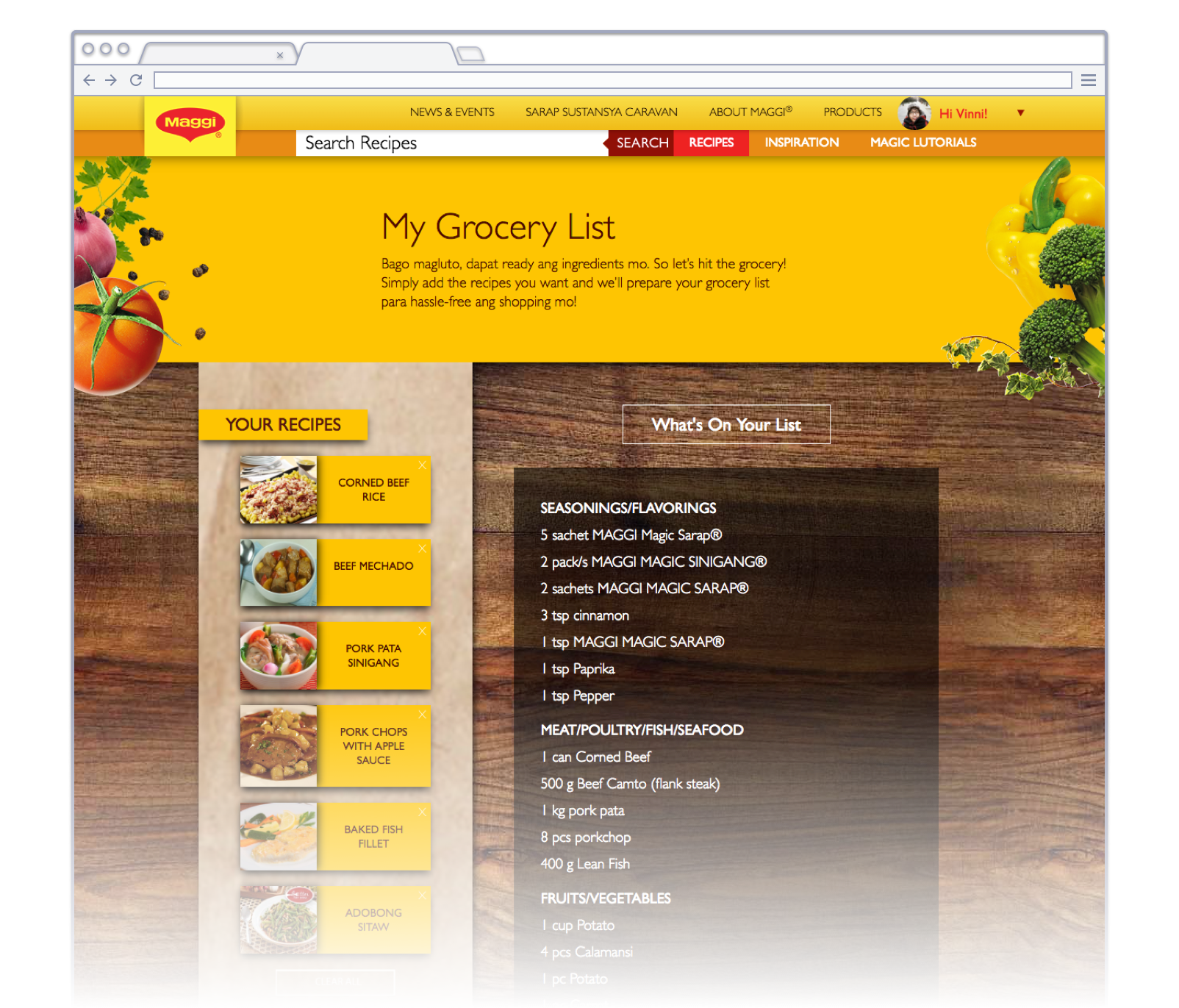
Users can add recipes to their grocery list and the site will generate a consolidated shopping list.
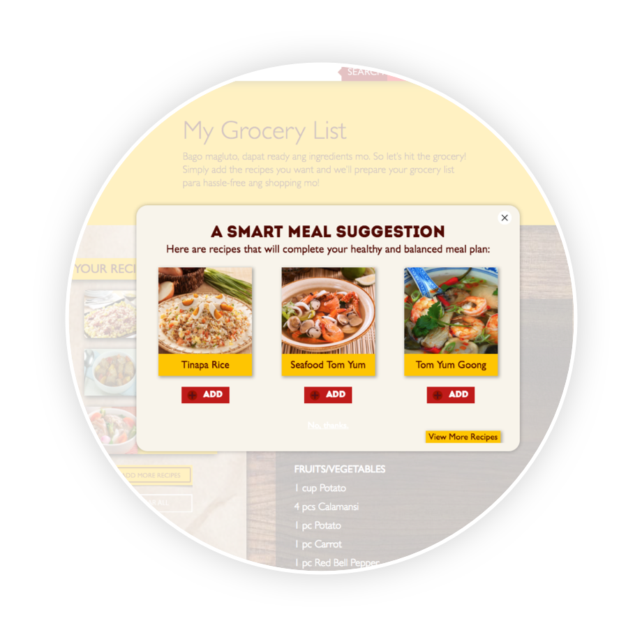 Meal Suggestions
The site recommends a recipe that will balance the nutrition based on what they added to their grocery list.
I worked with our planner to craft the website strategy that guided us with the design and key features. I created the wireframes and information architecture that is appropriate for the users but still keeping the brand in mind. Our art director and copywriter created the beautiful design.